
Hello brave adventurers!
Some select few of you may remember back when we were known as HabitRPG. We had this gradient logo, which was a contribution from the community!
![]()
And also, on the original mobile apps, we used this chest icon from Browserquest:

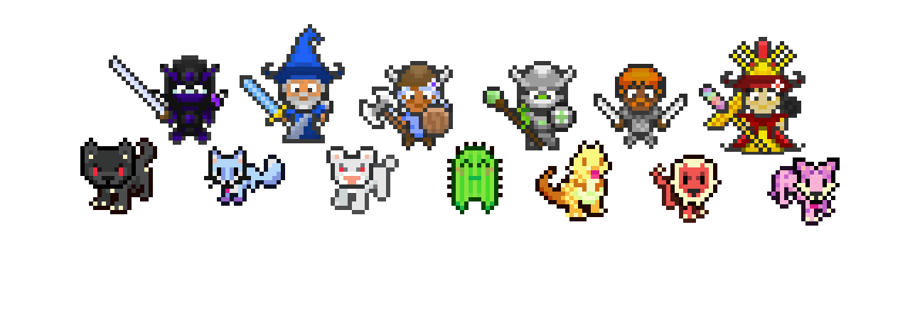
When we first decided that we needed to refresh the brand, we reached out to baconsaur, early community contributor pixel artist behind the Gryphon boss and the Mammoth pets and mounts. They had some great ideas:


You can hear the 8-bit MIDI song playing as that title unfurls! But something wasn’t quite right.
It was hard to link the mobile apps to the web site if you weren’t already familiar with what we were trying to do, and we were having trouble figuring out how to shrink the scroll down to an icon. We were also being gently encouraged by advisors, including designers and visual historians, to rethink our approach to be more welcoming of people who didn’t necessarily identify as core gamers, since that was already more than 40% of the userbase.
The clincher was having to explain to more than one kindly elderly gentleman that no, HabitRPG did not mean that you made a habit of rocket propelled grenades.
One offered alternative: calling ourselves Habit. Unfortunately, Habit is already a different app. We also felt that calling ourselves Habit sounded either really beige and boring, or reminded us of hamburgers.
Instead, we decided on “Habitica” to represent the new identity. Habitica was already discussed among the community as the name of the fantasy land we were all visiting while trying to be productive, and it felt fitting to elevate that name to more common usage. As one person put it, renaming HabitRPG to Habitica simultaneously made it more welcoming (because you didn’t have to know what RPG meant) and more immersive (Habitica as the domain–literally and figuratively–for improving your life!)
We also decided to expand our search outside the community for the first time, so we could broaden the scope of what our logo could look like. Our investors recommended 99Designs to help us get a sense of what was out there. We also knew we had a limited budget and were looking for a particular sensibility–something that could communicate a way of bringing a bit of fantasy into your real life.
While we opted not to use the contest option, largely because design contests are unfair to participants, we were able to narrow down to a few standout portfolios, including Zoran Lalic’s aka Camo Creative. Zoran appeared to be present on 99 Designs, but also had a well-established web presence on all the major design sites, like Behance (https://www.behance.net/camo) and Dribbble (https://dribbble.com/camocreative). His work also showed a solid understanding of fantasy themes and a goodly amount of range.
Zoran is one of the exceptions to our usual hiring process, where someone usually has worked with us in the community before coming on board for formal work. We had to do a bit more preparatory work in order to set him up with a strong understanding of what Habitica is.
One of the things we sent him was this imgur post that had gone viral at the time we were talking: https://imgur.com/gallery/GqLQG
Zoran got what we were trying to do pretty much immediately.
[3/6/2015 8:52:17 AM] Camo Creative: i was thinking about a dragon
[3/6/2015 8:52:22 AM] Camo Creative: if you have one in your game
[3/6/2015 8:52:26 AM] Camo Creative: or a knight
We also sent him a bunch of wiki links for Vice, Gryphon, and the Basilist. We also sent over an image of Recidivate Transformed, which was one of our newest quests at the time. (Zoran referred to it as “that spiky wurm thing” in case you needed a nickname to reduce the amount of terror induced by the Recidivate quest.)
[3/7/2015 6:25:42 AM] Camo Creative: YESS
[3/7/2015 6:25:50 AM] Camo Creative: i love the griffin and the dragons
[3/7/2015 6:26:06 AM] Camo Creative: i will try to do 3 different sketches
Then we got to see drafts. Zoran had a clear favorite.


We liked this fantasy based illustration, but realized this was just a higher resolution version of the problem we had with the pixel art logos. We also wondered how to tie this fantasy-based image back to the real world.
At some point in here, we decided to focus on the gryphon as our representative.
[3/24/2015 7:08:30 PM] Vicky Hsu: we’d also like to see something that’s more real-world related, so maybe the griffin can be holding something
[3/24/2015 7:08:49 PM] Vicky Hsu: maybe a toothbrush, maybe a pencil and a clipboard? we’re open to ideas


Then we started to think about how to use the logo, and asked if we could have a design that had both an image and the wordmark to be used both independently and separately. We also wanted to nudge the design towards a more logo type style rather than an illustration.
[3/30/2015 8:48:42 AM] Camo Creative: http://thumb9.shutterstock.com/photos/display_pic_with_logo/375898/147171422.jpg
[3/30/2015 8:48:46 AM] Camo Creative: maybe something like this
[3/30/2015 8:48:51 AM] Camo Creative: silhouette of a griffin
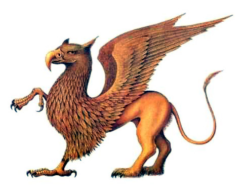
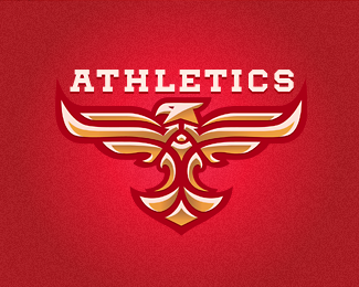
Image swapping ensued. Did you know there are already a bunch of companies using the gryphon as a mascot?

Something about the brandcrowd example was particularly appealing in terms of the posture.
[4/1/2015 2:09:15 AM] Camo Creative: yeah, he is acting tough, but he is funny 😀
[4/1/2015 2:11:46 AM] Camo Creative: http://www.stepbystep.com/wp-content/uploads/2013/07/How-to-Draw-a-Griffin-Mythical-Creature.jpg
[4/1/2015 2:11:53 AM] Camo Creative: ahahaha this face is epic 😀
[4/1/2015 2:12:19 AM] Camo Creative: i can imagine him holding a toothbrush
Then there was more image research and exploration:


But we kept circling back to this image:

And then:

The first instance of the gryphon that would eventually become Melior made his first appearance. Look at that smirk!
Then we went down a side path exploring possible variations. Which way would a gryphon hold a toothbrush? Or wear a tie?


But we didn’t want to come across as a toothpaste company, or a briefcase supplier.
Maybe something a little more general?


It felt like we were getting close, so we did some research on how exactly to incorporate the wordmark while continuing to play with different ideas, like giving the gryphon some neckware and some facial expressions.


At this point, we started asking Sara Olson her opinion. Sara had been working with us on the mobile apps, and in conversation we realized that she had a really good eye and vocabulary for the kind of logo we wanted. We decided that it might be easier if we brought the project in-house to continue developing this logo.
Sara opted to go back to the drawing board and do some brainstorming to see if this is what we really wanted. Here’s her original mind map of what Habitica looked like.

From there, she started to doodle some possible concepts:
saraolson:
basically it was just:
-gryphon
-polygonal game art
-pixel game art
-game items: gems/weapons/items/scrolls
-the H for habitica
and just exploring within that
Gradually, the ideas were refined into this collection:

She also started playing around with some of these ideas, which you can see below.


We were still fond of the gryphon, though, so we started trying out different variations.

At some point we decided on the purple as the color to focus on, because of its connotations of luxury, royalty, and fantasy. For a while we tried a brighter, more Twitch-like purple, but eventually deepened it to the dark, almost midnight purple that we use today.


(Incidentally, you may see some lighter versions of this deep dark purple show up here and there. We’re always experimenting!)
We also incorporated the red and blue colors that show up in task values, but into the two dots on the i’s of Habitica. It seemed to brighten the logo—a little less serious, and a bit more fun. Candy colors!
Once we had settled on this design, we ran a Name the Gryphon challenge so the community could suggest names for the gryphon. Melior was NobleTheSecond’s suggestion and was selected because, as the wiki states, “[t]he name represents how Habiticans strive to become better at their goals in their quest to improve their lives.”
So there you have it—the long, winding journey of how the Melior logo came to be. I’ll leave you with this amazing work that came out of the community when we announced the change: professional embroidery designer Erich Campbell’s rendition of the gryphon as an embroidered fabric patch!


So cool seeing the design evolution of such an awesome brand, thanks for sharing!!!
LikeLike
Thanks for reading!
LikeLike
As someone studying graphic design, it’s interesting to see the process behind logo design. Thanks for giving us this little insight on how much work goes into habitica.
LikeLike
You’re welcome! Process is always interesting, and good logos take a lot of thought, so it was an honor to be able to show the work that went into getting us here.
LikeLike
as someone who long since graduated graphic design school, and has worked in the world for years, it’s very nice to see the process respected. I can’t tell you how many people rush logos, and the designs suffer for it!!!! LOVE this.
LikeLiked by 1 person
I was literally just thinking the other day what a cool logo Habitica has! Fun to read the backstory!
LikeLike
Thanks! We’ve grown quite fond of it.
LikeLike
Where can we buy those awesome patches?
LikeLike
The few we had were samples- but in the future it’s possible we might make more to sell if there’s enough interest!
LikeLike
As we all know, everything is better with a gryphon.
“It is a well-known fact!”, to quote Kelvren the Brave.
Love from Larry Dixon and Mercedes Lackey. We’re working on the new Valdemar book, “Gryphon of Light” (Kelvren of course!) and suddenly, I was asked about Habitica on Twitter! It made me reminisce about meeting you all at, I think it was–Gen Con? You were so affable, and interesting to chat with. Just a delight.
Let’s stay more in touch!
–Larry (The Gryphon King) Dixon :} <–that is supposed to be a beak smile emoji
LikeLike